Case Study : Kuoni
Background
Client: Kuoni
Duration of Project: 2 weeks
Kuoni is a global leader in the travel industry for the past 110 years, knowledgeable about the travel requirements of consumers and business partners, and translating them into contemporary travel products.
Kuoni has over 8,000 employees in over 100 countries, on all 5 continents. They use this network to provide customers—if they wish—with a local destination expert who can guide them and help them.
Kuoni wants to allow their users the ability to communicate online with agents and to manage—or talk about—every aspect of their quotes or bookings. They want to make the information also easily accessible, so customers can access it while they are traveling, too.
Design Goals & Objectives
Design the post-log-in experience for managing a quote, seeing the trip booking information, and managing bookings online. Since consultancy and advice are at the core of the business, don't make the whole experience self-service for the user, but rather, make sure they interact with the personal travel expert.
Empathize
Research Goals
What information needs to be provided for creating the perfect, tailor-made trips?
What information do they need to feel confident that Kuoni has their best intentions?
Are there any hesitations to using a travel agent?
How do people like to collaborate with others when planning?
Methodologies
I initially tried to go through the current process Kuoni offers by reaching out to a personal travel expert to see what types of questions are asked and what an initial itinerary looks like for a customer. However after a couple attempts, I did not hear back so I decided to go in a different route.
I looked through the different pages of Kuoni's website to get a better sense of the brand. As I was looking through different pages, I noticed there were a lot of inconsistencies with layouts, buttons, and filters. As I continued my research, I took screenshots & notes of commonalities and started an interface inventory.
Interview
Once I had a grasp of Kuoni as a brand, I wanted to interview users who have recently traveled for more than 3 days. What their process was when planning with others, what kind of information led them to ultimately book the specific activities, accommodations or flights. I also wanted to understand the most difficult parts of planning a trip and their experience with travel agents.
4 participants (3 female, 1 male)
Age ranges: 27-33
Varying professions, marital status, education, number of members in household
Key Findings
Trust - All participants mentioned they did not trust travel agents nor really found them helpful.
Local Hacks - All participants mentioned the hardest part about planning is finding information about local knowledge such as if specific times or areas are dangerous or walkable, finding the "fun" spots for specific age ranges.
Time - All participants did not specifically call this out, but they all spoke about spending lots of time researching and the time it took to aggregate all the information.
Points - Most participants spoke about checking to see if they could use their points first before booking with credit cards.
Define
Project Goals
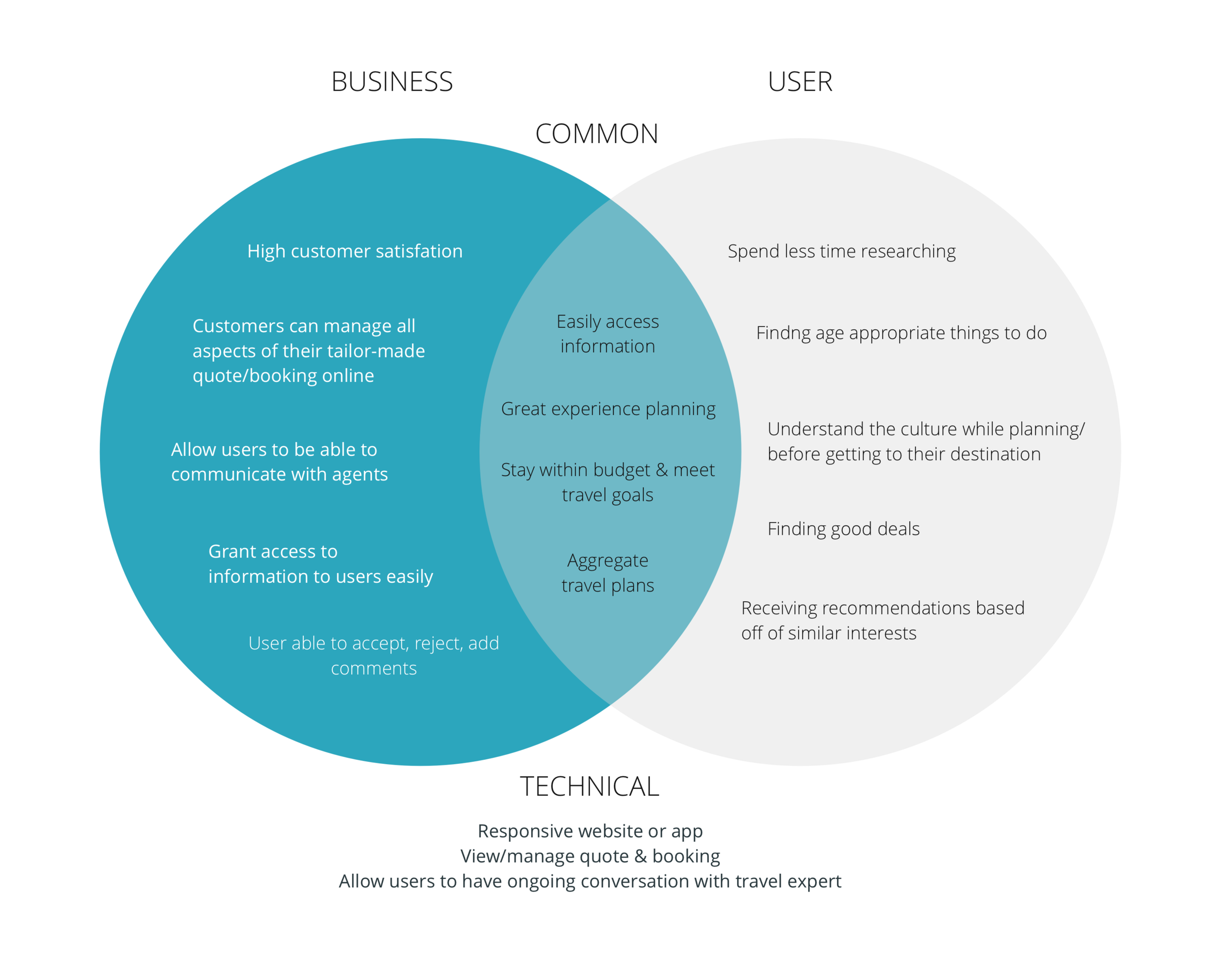
Knowing the user goals, I wanted to find the commonalities with Kuoni's goals to see what I needed to solve for and incorporate in my design.
Product Feature Roadmap
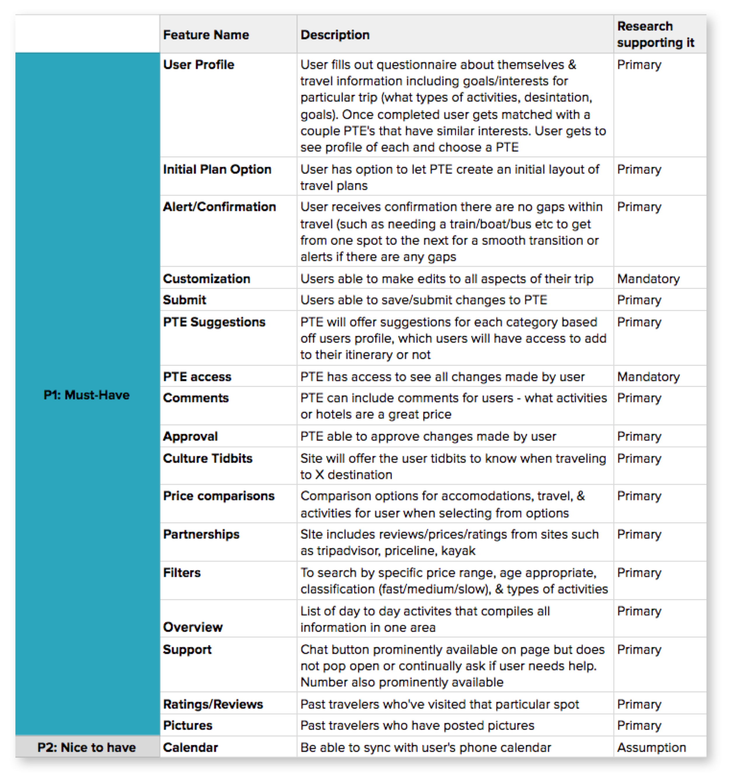
Having those project goals in mind, I started to think about what features would be needed to allow users to be successful in their process of planning.
Task Flow
Before I started sketching out the layout of the pages, I wanted to figure out what the flow would look like if a user wanted to create an activity. I chose the task of a user starting to set up the details of their trip, specifically creating an activity. I chose this task because I felt that this would be an area that could be confusing and could cause the most uncertainty since you can book multiple activities on multiple days.
Ideate
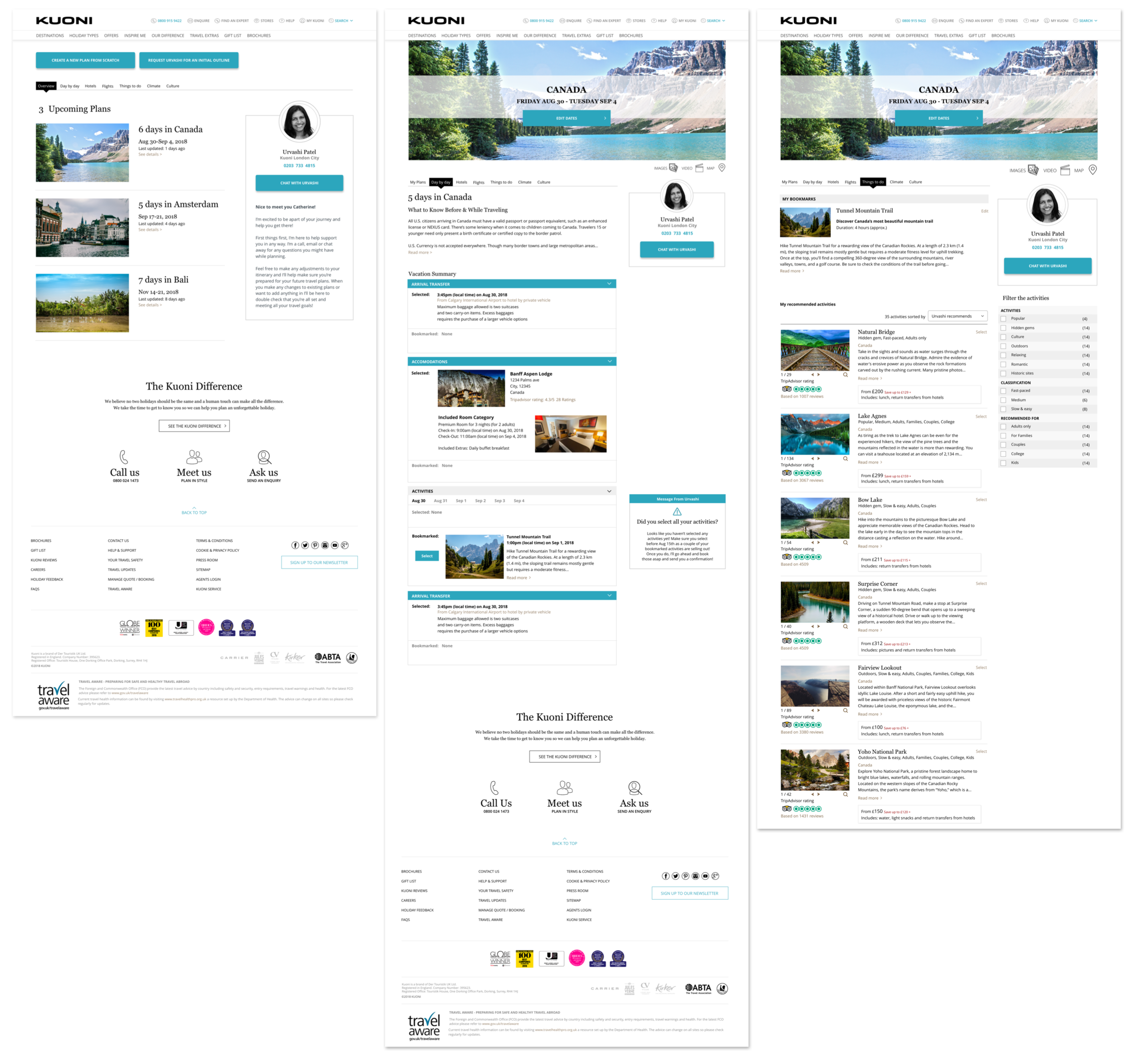
To begin sketching, I took another look at Kuoni's website. I started a rough sketch on paper and quickly moved into Sketch. I took the items in my interface inventory and created symbols and started placing the items on the page to hone in on the layout.
Prototype
High Fidelity Wireframes
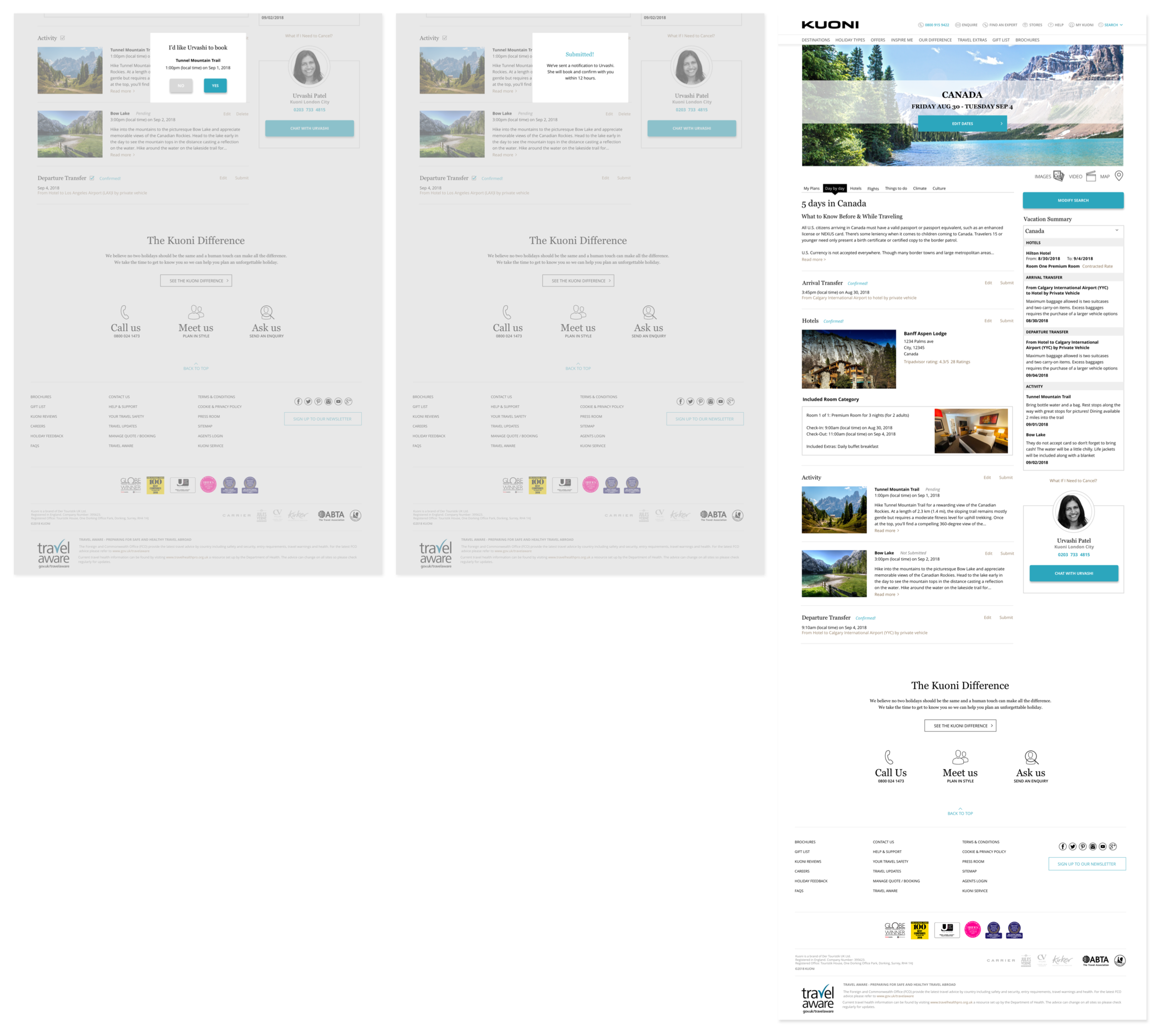
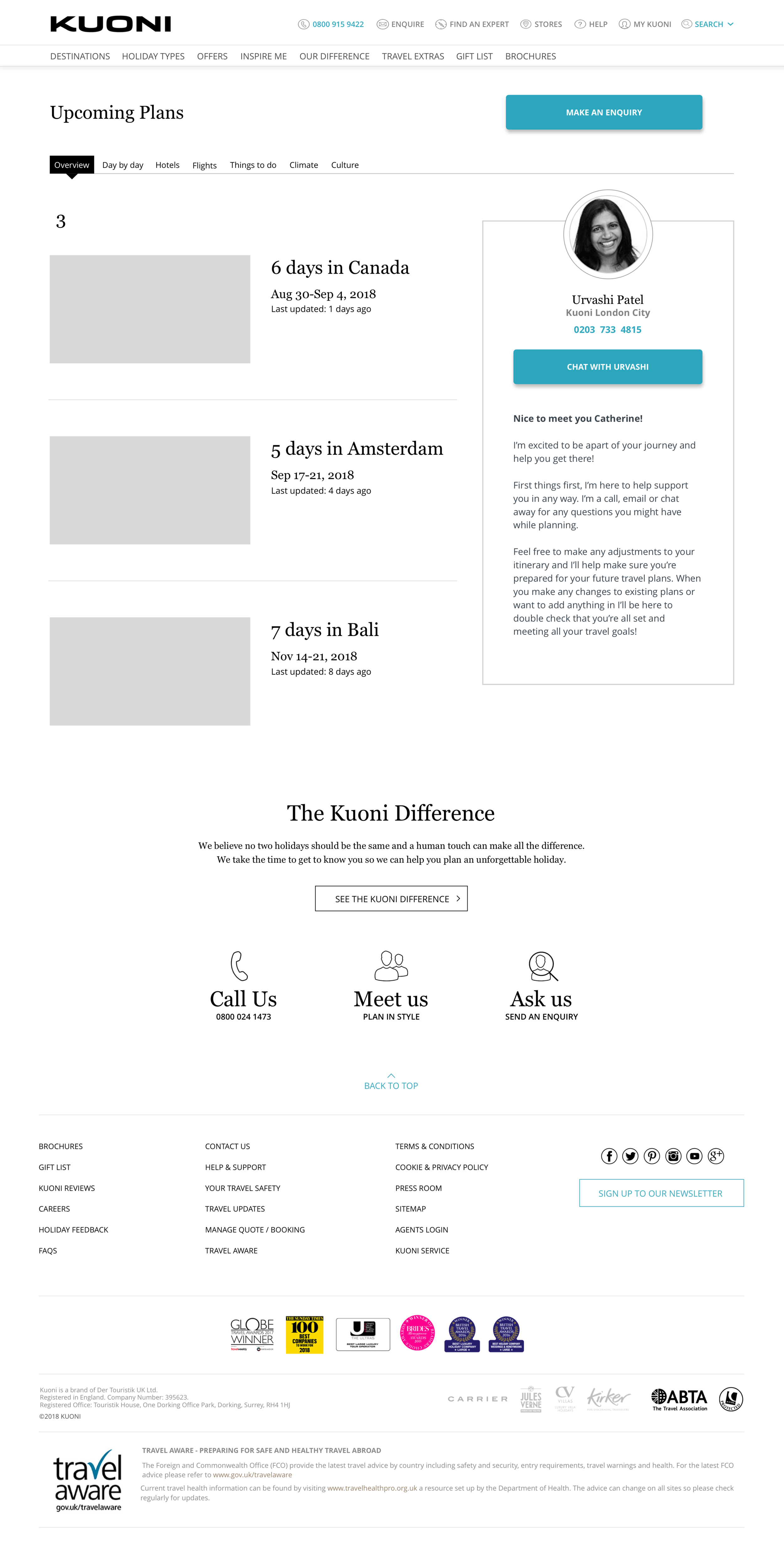
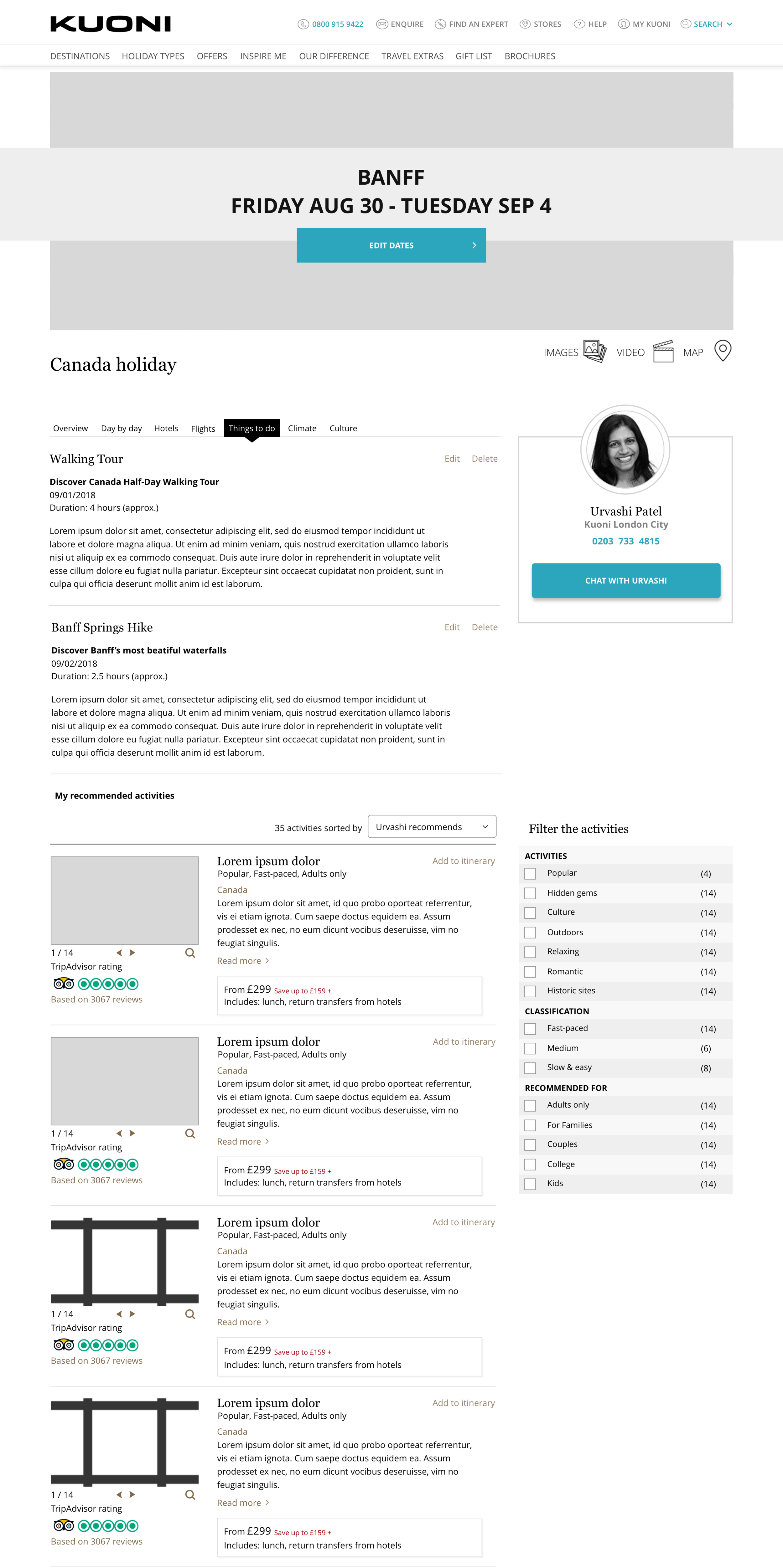
Now was my favorite part, putting it all together! After I created higher fidelity wireframes, I took a step back to see if I had translated all my thoughts around the process onto Sketch. I realized I was missing a couple steps and created a few more pages that I felt were necessary.
User Testing
Participants: 3 users ages 26-31 (2 male, 1 female)
Test Subject: High fidelity prototype for Kuoni website (desktop version)
Test Methodology: Google Hangouts & Zoom
Test Goals:
Evaluate the users process and interaction with Kuoni’s pages
Identify any pain points and confusions with content on pages
Identify what information is missing
Does the flow make sense?
Key Findings:
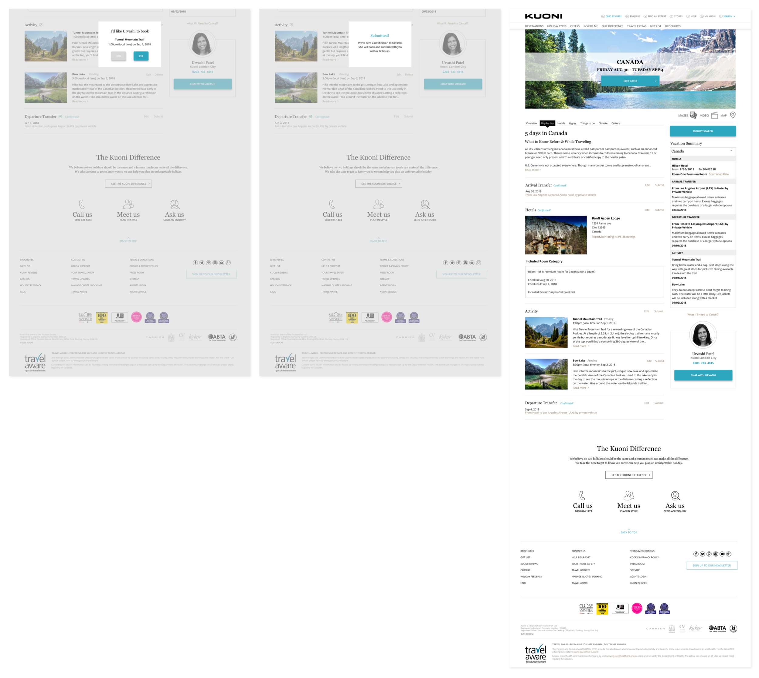
Most users could not distinguish the difference between the different status information such as "pending" & "not submitted". They also found the button "Add to Itinerary" to feel permanent which led to the confusion of why they needed to submit an activity. I also found that most users ignored most of the right hand side of the page and mentioned it came secondary to the content on the left.
Reiterations
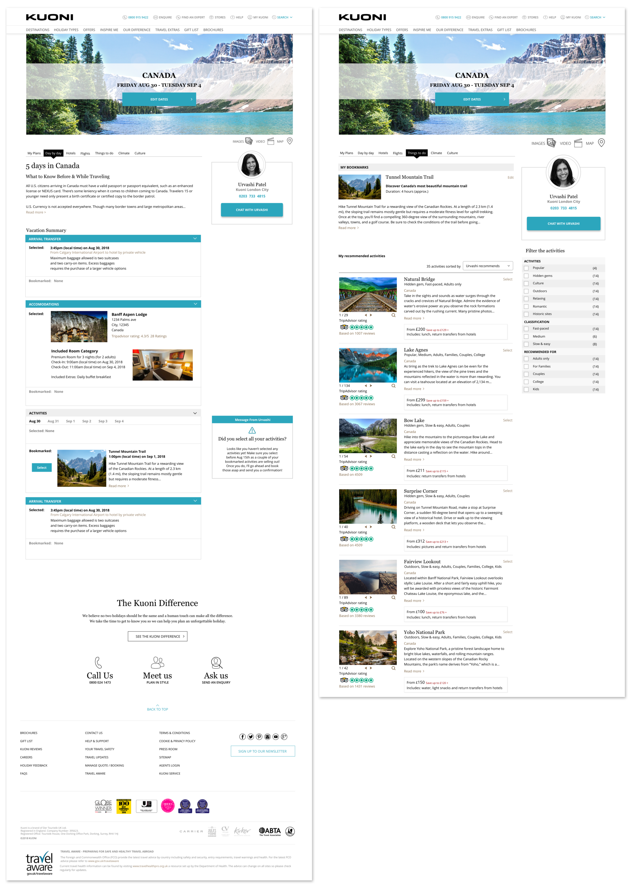
Using the findings from my usability test, I adjusted the elements that caused the most confusion which then changed some layout of some pages altogether.
Next Steps
Using these updated higher fidelity wireframes, I'd like to create a new prototype using Invision and conduct a usability test to see if users run into areas that cause any similar or new pain points/confusion that the first batch of users faced.


